26 Tailwind CSS UI kits and component libraries, both free and paid
Need some pre-made components? Check out these UI Kits and component libraries made with Tailwind CSS
 Red Pixel Themes
Free UI kits

Flowbite
- Has React, Vue.js, Svelte and Angular versions
- Includes 51 open-source UI components and 120+ block sections
- Design available in figma
Flowbite is an open source collection of UI components built with the utility classes from Tailwind CSS that you can use as a starting point when coding user interfaces and websites, it also can be included as a plugin into an existing Tailwind CSS project.

Tailblocks
- Includes 60+ Blocks
- Has dark mode and multiple color variations
- Works as copyable HTML snippets
Tailblocks provides multiple blocks built using Tailwind CSS that you can use in your own projects. This project is not a dependency that you add to your project, but instead provides you with HTML that you can easily copy and paste into your own project.
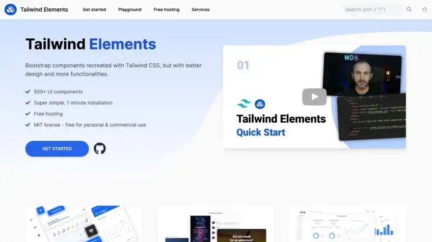
Tailwind Elements
- Work as a Tailwind CSS plugin
- Includes 500+ UI components
- MIT license - free for personal & commercial use
Tailwind Elements is a plugin that extends the functionality of the library with many interactive components. In some dynamic components it adds Font Awesome icons and custom JavaScript.
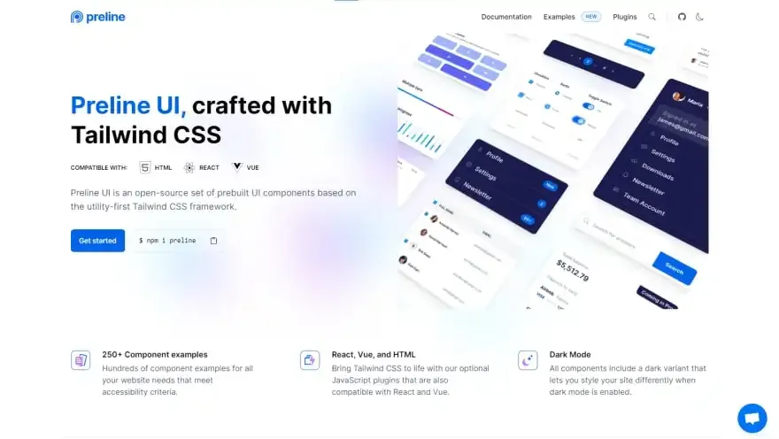
Preline UI
- Works as a Tailwind CSS plugin
- Includes 250+ components
- Dark mode available
Preline UI is based on the Tailwind CSS utility classes, help you quickly design and customize responsive mobile-first websites with the most used components, including buttons, dropdowns, navigation bars, modals, and more.

Float UI
- Built with React + Tailwind CSS
- Includes 12 component categories
- Components include a RTL version
Float UI is a collection of ready React components, such as CTA sections, Newsletters, Cards, Navbars, Footers, etc. The components are beautifully designed and expertly crafted that allow you to build a great UI/UX, and are easy to customize.
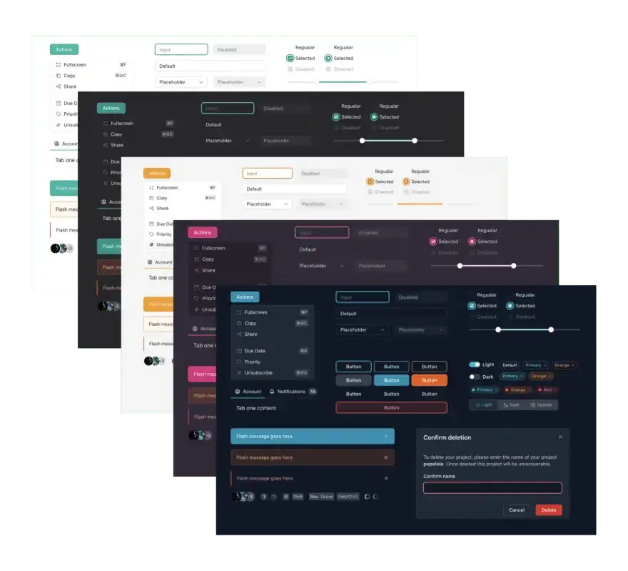
VechaiUI
- Works with React
- Includes a Dark mode out of the box
- Includes pre-designed Headless UI components
VechaiUI is a set of high-quality accessible React UI components with the built-in dark mode using Tailwind CSS. Pre-designed headless ui and radix-ui.
tailwindcomponents
- Includes 650+ components
- Has premium paid components available
- A lot of components include dark mode
Tailwind Components has a whole collection of over 600+ free UI components and templates built with the utility classes from Tailwind. These components are easy-to-use and allow you to preview and copy/paste HTML snippets directly into your codebase to use or modify. From ready-to-use dropdowns, logins, modals, tabs, inputs, and selects to whole templates.
HyperUI
- Built with Tailwind & Alpine.js
- Has two component categories: e-commerce and application UI
- Includes 200+ components
HyperUI is a collection of free Tailwind CSS components that can be used in your next project. With a range of components, you can build your next marketing website, admin dashboard, ecommerce store and much more.
daisyUI
- Works as a plugin for Tailwind CSS
- Has 45 components and 29 themes
- Uses component classes (ex:
btn btn-primary) instead of utility classes
The most popular, free and open-source Tailwind CSS component library

Mamba UI
- It’s a collection of pre-made HTML components, a la Tailwind UI
- Includes 140 components in 37 categories
- Also includes 3 ready-made templates
Mamba UI is a UI kit with free components and templates styled with Tailwind CSS

Headless UI
- Works as a framework plugin, has support for Vue and React
- Come completely unstyled, ready to work with Tailwind CSS classes
- All components are fully accessible
Completely unstyled, fully accessible UI components, designed to integrate beautifully with Tailwind CSS.
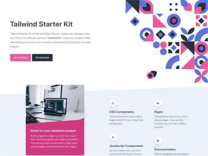
Tailwind Starter Kit
- Works as HTML snippets, a la Tailwind UI
- Includes both HTML/CSS components and JS components
- Has versions for plain HTML, Vue, React, and Angular
- Has lots of documentation
A beautiful extension for TailwindCSS. It features multiple HTML elements and it comes with dynamic components for ReactJS, Vue, and Angular.
Material Tailwind
- Works as a React Library
- All styles are based on material design
- Have 5 ready-made templates
@material-tailwind is an easy-to-use components library for Tailwind CSS and Material Design. It features multiple React components, all written with Tailwind CSS classes and Material Design guidelines. Coming soon components for VueJS, Angular and many more.

Gust UI
- Works as a React library
- Includes 50+ components and 4+ example pages
- Uses icons from font-awesome
Responsive HTML & React components for your next web application. Make your tailwind apps even sleeker and faster to develop with our ever-growing library of components, elements, and example pages.
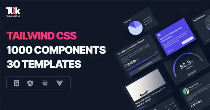
TUK (Free)
- Works as HTML snippets and also supports Vue, React, and Angular
- Free version has 250 components available
- Has Webapp, Marketing, and Ecommerce categories
Tailwind CSS components & templates with support for React, Angular, & Vue. 250 FREE Responsive, accessible & drop-in ready components available.

Kometa UI Kit
- It’s a collection of HTML snippets, a la Tailwind UI
- Includes 130+ responsive components
- Available in HTML, VueJS, and React
Kometa UI Kit includes over 130 sections, built with TailwindCSS, for your awesome projects. All the sections are fully responsive and available in HTML, VueJS, and React. You can use them on unlimited personal and commercial projects.
Meraki Ui
- Works as a collection of HTML snippets
- Includes 108 Components
- All components include a dark mode
Tailwind CSS components that support RTL languages & fully responsive based on Flexbox & CSS Grid with elegant Dark Mode.
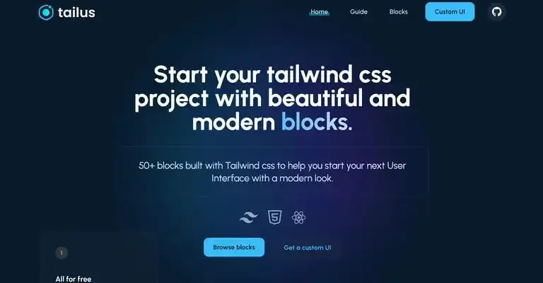
Tailus
- Works as a collection of HTML snippets
- Includes 50+ Components
Tailus blocks is a set of +50 beautiful and modern responsive UI Blocks built with Tailwind CSS.
Paid UI kits
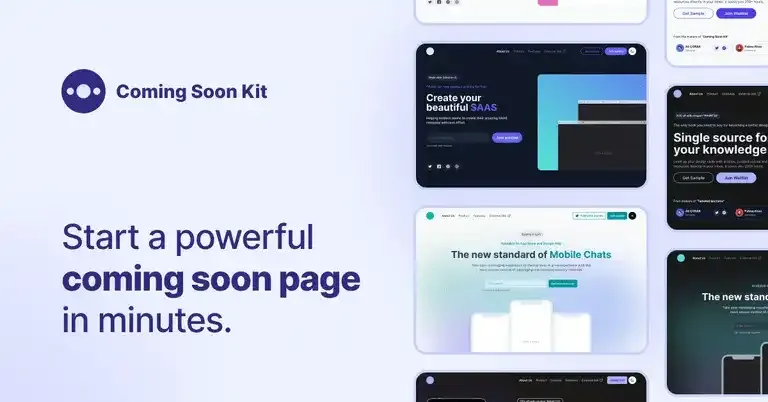
Coming Soon Kit
- Get it here
- Price: $25-$78
- Built with Tailwind & Alpine.js
- All templates have dark & light mode
- Integrated with Mailchimp and Vercel
50+ unique templates for SaaS products, mobile apps, info products, and more. Effective way to reach the potential customers before the launch.
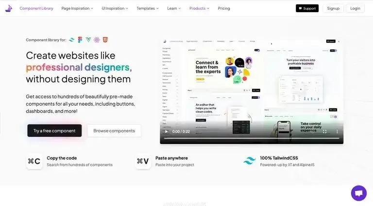
Landingfolio
- Get it here
- Price: $49 - $264
- Built with TailwindCSS and AlpineJS
- Works as a collection of HTML snippets
- Includes 550+ components
550+ components and growing. With lots of unique blocks, you can easily build a page without coding. Build your next website in just a few clicks.

Tailwind UI
- Get it here
- Price: $149 - $279
- The Official UI kit for TailwindCSS
- Has HTML, Vue, and React versions
- Includes 500+ component examples
Over 500+ professionally designed, fully responsive, expertly crafted component examples you can drop into your Tailwind projects and customize to your heart’s content. Get started by checking out our free preview components, or browsing all of the examples in the categories you’re most curious about.

Harmony Pro Premium
- Get it here
- Price: $89
- Includes 40+ pages, 60+ sections and 100+ components
- Interactivity is done with Alpine.js
Harmony, a simple and modern UI Kit for your SAAS
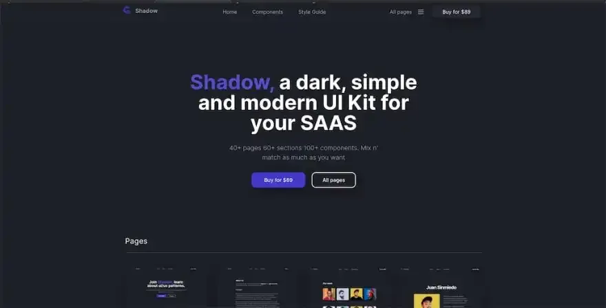
Shadow Premium
- Get it here
- Price: $89
- Basically the dark mode version of Harmony above
- Includes 40+ pages, 60+ sections and 100+ components
- Interactivity is done with Alpine.js
Shadow, a dark, simple, and modern UI Kit for your SAAS
TUK (Paid)
- Get it here
- Price: $249 - $750
- Works as HTML snippets and also supports Vue, React, and Angular
- Has Webapp, Marketing, and Ecommerce categories
- Full version has 1000+ components
Build captivating experiences with accessible, fully responsive, drop-in-ready Tailwind CSS components and fast-track your workflow.
Razor UI
- Get it here
- Price: $89
- Works as HTML snippets
- Has a Laravel Blade version
- Includes 100+ components
Designing a consistent component library is difficult, expensive, and takes a lot of time. Our solution? Razor UI: a modern-looking UI kit for Tailwind CSS. Save precious time and money with interactive components and templates you can drop right into your project.
Tailgrids
- Get it here
- Price: $89 - $199
- Works as HTML Snippets
- Includes 300+ UI Components
- Includes Figma Source File
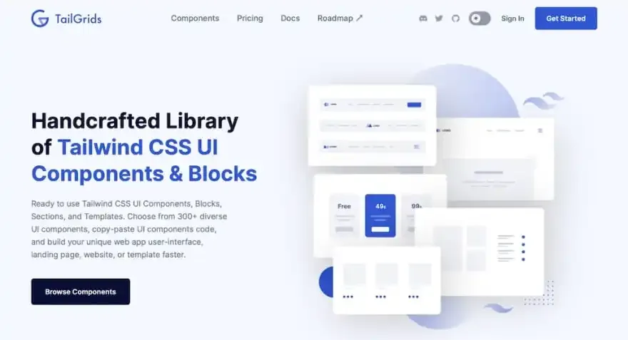
Ready to use Tailwind CSS UI Components, Blocks, Sections, and Templates. Choose from 300+ diverse UI components, copy-paste UI components code, and build your unique web app user interface, landing page, website, or template faster.